Challenge
Challenge
Rethinking a poorly reviewed distance learning platform for one of the most renowned Institutions of technical education in Brazil, so that it matches students’ expectations as to what online courses from such institution should feel like.
Creating a Web System from scratch to unify the operations from VIVA, a Photo Concierge company that works inside resort hotels.
My role
My role
Information architecture, UI Design
Platforms
Web on Desktop Computers; Web on Tablets
Year & duration
Year & duration
2017, 2 months
Client
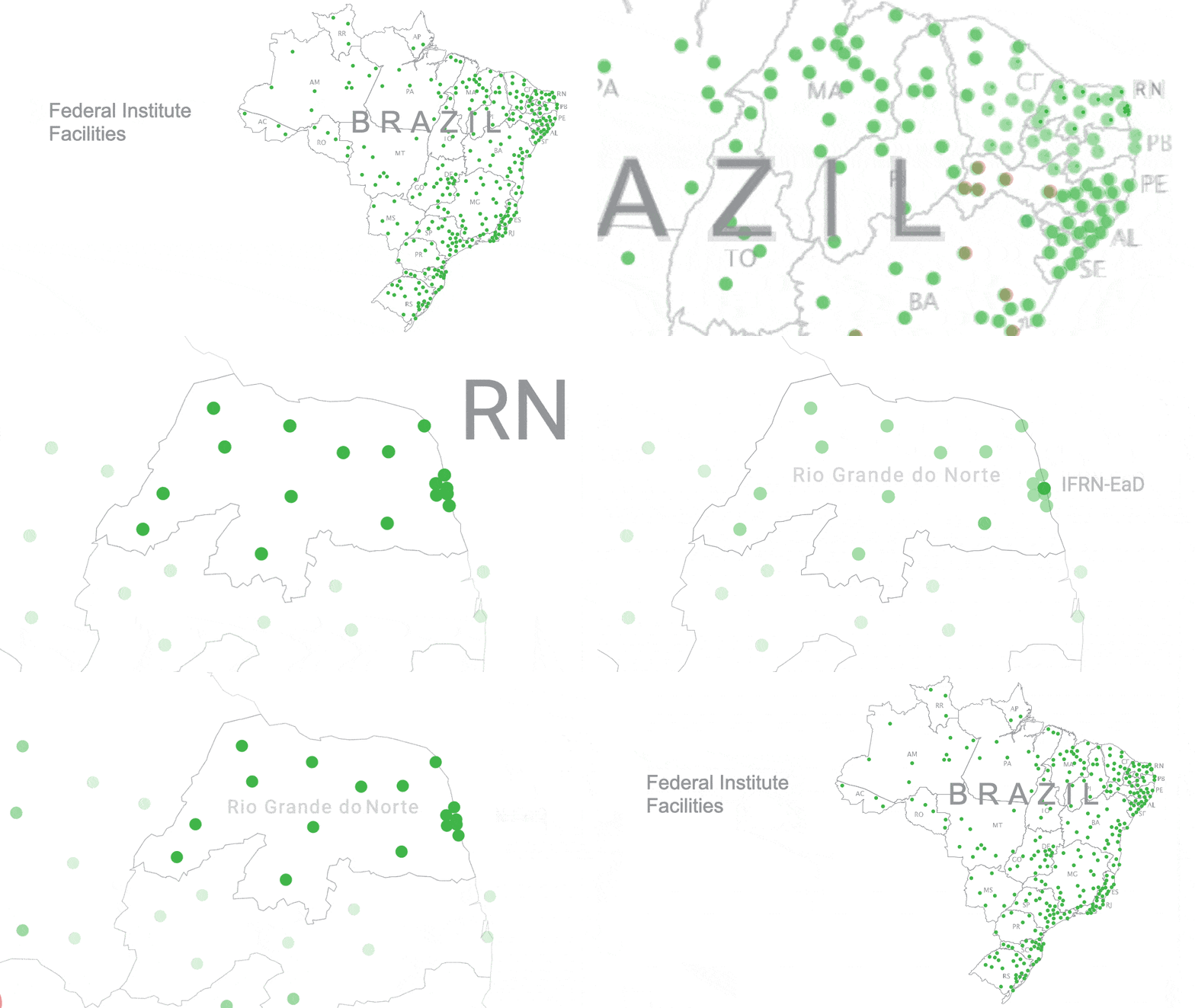
The Federal Institute of Education, Science and Technology (IF) is a renowned Brazilian institution recognized for its excellence in technical and higher education.
Operating across all 27 Brazilian states, each regional branch, including the State of Rio Grande do Norte, boasts its own autonomous governing body. In this context, IFRN-EaD, an affiliate specializing in Distance Learning courses, faced the challenge of low satisfaction with its e-learning platform.
Discovery phase
The problem
The platform is held in low esteem, not only by students but also by professors and even by its own developers. Additionally, the IT Director ran a survey which identified several of the most commonly voiced complaints.
Uninteresting
Uninteresting
Very unnactractive
Far outdated
Way below the quality we expect from such an institution
Our Investigation
What is ‘attractive’ and, more importantly, what do they mean by ‘engaging’?
They, not the project director, serve as the true evaluators of our product.
Chosen research methods and tools:
- Survey;
- User personas (not to be confused with marketing personas)
- Shadowing;
- User journey mapping.
01. Survey and Audience Research
01. Survey and Audience Research
Google forms + Google sheets.
The project started with a user satisfaction survey, which included their suggestions for improvements, their main complaints and main usage scenarios.
The most relevant information guided our decisions to prioritize features that were missing from the product and defined our target audience in the form of personas.
02. Personas
02. Personas
02. Personas
01. Personas
02. Personas
They are a mix of the actual individuals we're designing for, just with different names. They play a pivotal role in shaping our design decisions.
They are a mix of the actual individuals we're designing for, just with different names. They play a pivotal role in shaping our design decisions.
They are a mix of the actual individuals we're designing for, just with different names. They play a pivotal role in shaping our design decisions.
The real people whom we are desining for, summed up to a few, but compelling characters, guiding our decisions.

Anderson, 20 yr
Anderson, 20 yr
Anderson, 20 yr
Unemployed, student
Unemployed, student
Unemployed, student
Primary Access:
Desktop PC, at home
Primary Access:
Desktop PC, at home
Primary Access:
Desktop PC, at home
Secondary Access:
N/A
Secondary Access:
N/A
Secondary Access:
N/A
Secondary Access:
N/A
Pros & Cons of the AVA Platform:
+ Easy to use
– Very Limited interaction with classmates and teachers
- Lack of notifications about classes and news
Pros & Cons of the AVA Platform:
+ Easy to use
– Very Limited interaction with classmates and teachers
- Lack of notifications about classes and news
Pros & Cons of the AVA Platform:
+ Easy to use
– Very Limited interaction with classmates and teachers
- Lack of notifications about classes and news

Mariana, 28 yr
Mariana, 28 yr
Mariana, 28 yr
Saleswoman, student
Saleswoman, student
Saleswoman, student
Primary Access:
Desktop PC, at home
Primary Access:
Desktop PC, at home
Primary Access:
Desktop PC, at home
Secondary Access:
Smartphone, while waiting in lines or commuting
Secondary Access:
Smartphone, while waiting in lines or commuting
Secondary Access:
Smartphone, while waiting in lines or commuting
Pros & Cons of the AVA Platform:
+ Convenient
- Disorganized Interface
– Very Limited interaction with classmates and teachers
- Lack of notifications about classes and news
Pros & Cons of the AVA Platform:
+ Convenient
- Disorganized Interface
– Very Limited interaction with classmates and teachers
- Lack of notifications about classes and news
Pros & Cons of the AVA Platform:
+ Convenient
- Disorganized Interface
– Very Limited interaction with classmates and teachers
- Lack of notifications about classes and news

Luciano, 45 yr
Luciano, 45 yr
Luciano, 45 yr
Professor
Professor
Professor
Primary Access:
Desktop PC, at work
Primary Access:
Desktop PC, at work
Primary Access:
Desktop PC, at work
Secondary Access:
N/A
Secondary Access:
N/A
Secondary Access:
N/A
Secondary Access:
N/A
Pros & Cons of the AVA Platform:
+ Flexible Schedule
– Very Limited interaction with classmates and teachers
- Lack of notifications about classes and news
Pros & Cons of the AVA Platform:
+ Flexible Schedule
– Very Limited interaction with classmates and teachers
- Lack of notifications about classes and news
Pros & Cons of the AVA Platform:
+ Flexible Schedule
– Very Limited interaction with classmates and teachers
- Lack of notifications about classes and news
03. User Journey
02. User Journey
03. User Journey
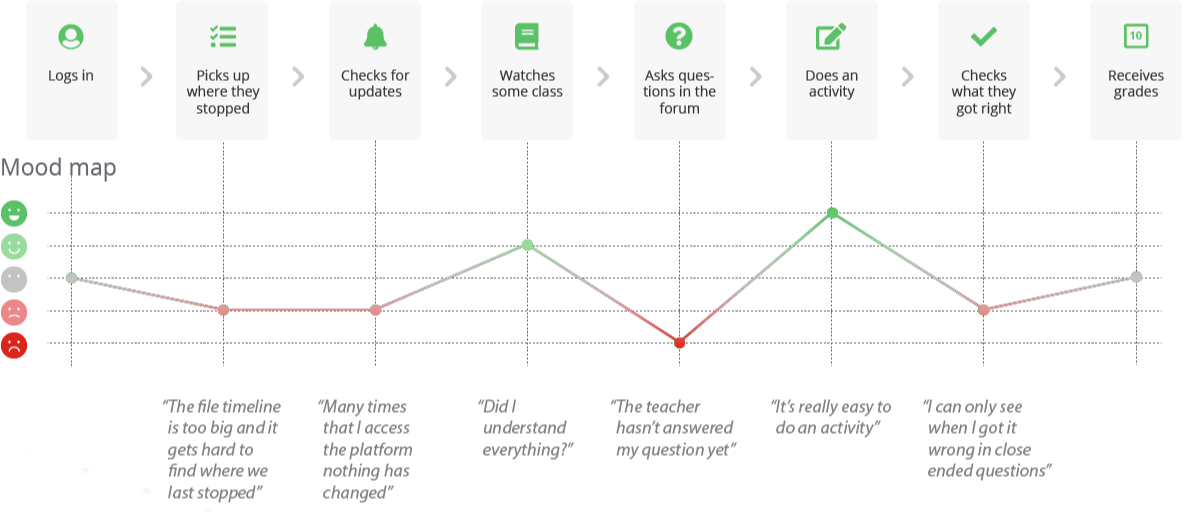
With this tool, we delved into the path of users within the AVA Platform, gaining insights into moments that bring both frustration and satisfaction.
04. User Goals
04. User Goals
💬
Communication
💬
Communication
Enhance the potential for interaction between teachers and students, ensuring quicker responses to student queries.
🔔
Notifications
🔔
Notifications
Alleviate the frustration of not being aware of new class openings, assignment notifications, or additions of new media to the classes.
📝
Exams and Exercises
📝
Exams and Exercises
Improve the feedback mechanism for grading exams and exercises.
🖥
Usability
Reduce user cognitive load by incorporating more visual cues, feedback mechanisms, and establishing visual consistency on the platform.
👥
Community
👥
Community
Foster rich interaction possibilities akin to a physical classroom setting.
📅
Routine
Facilitate a daily study routine by ensuring that students’ questions are promptly addressed by teachers.
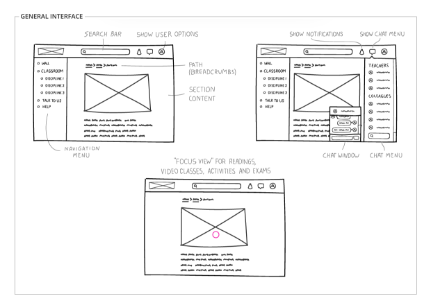
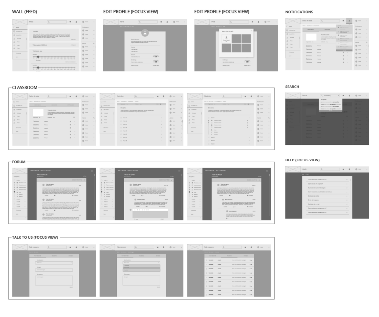
05. Wireframes & low-fi prototypes
05. Wireframes & low-fi prototypes
06. Hi-fi prototypes
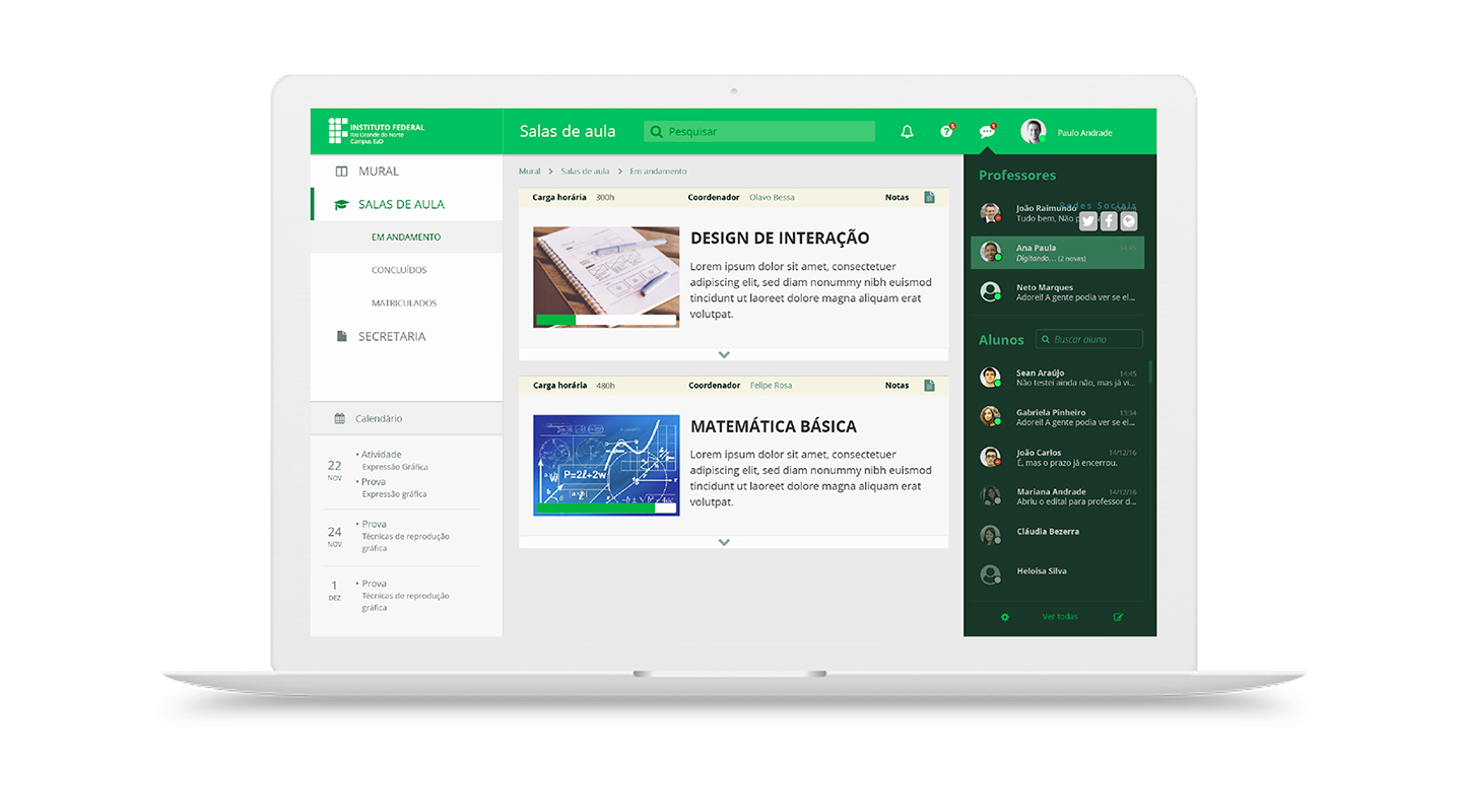
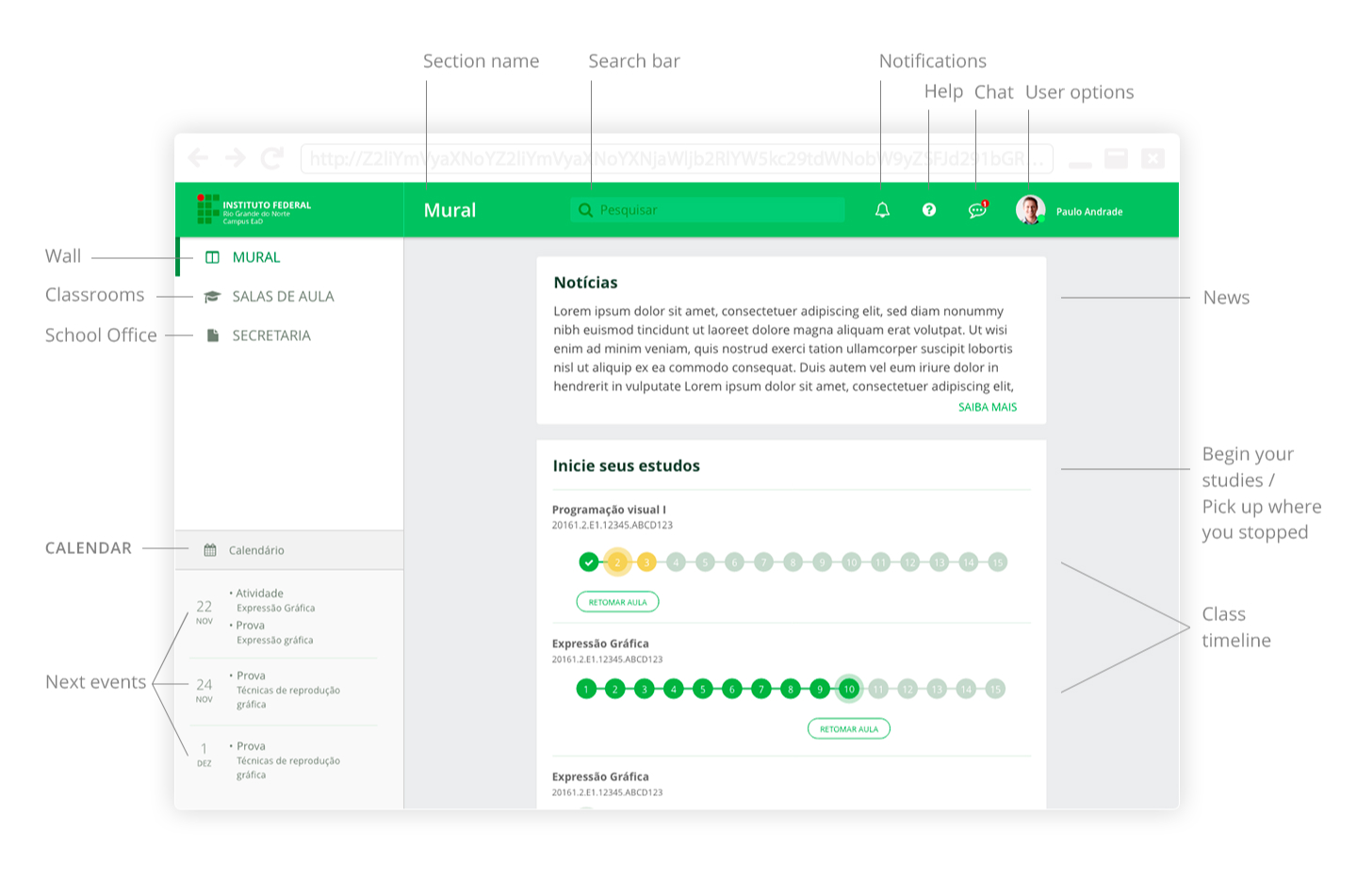
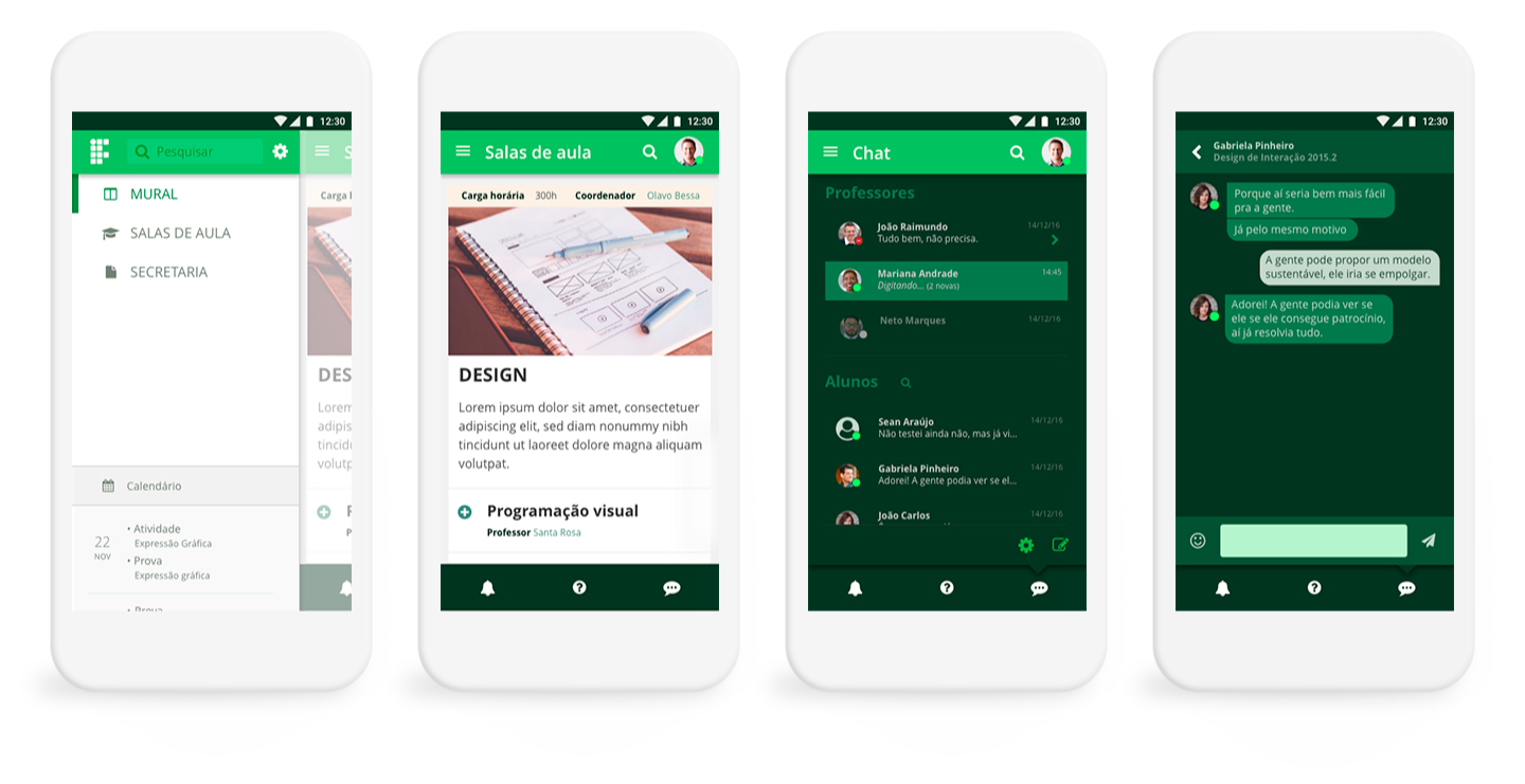
General Navigation UI
The user is greeted with news on the 'wall' and a summary of their recent activities, prominently displayed. In this interface, all virtual spaces are designed to resemble the layout of the most commonly used social media platforms.
Course UI
This UI eliminates distractions, enabling easy navigation among course subjects and media, or returning to the General Navigation. It is ideal for video classes, educational games, and forum threads.
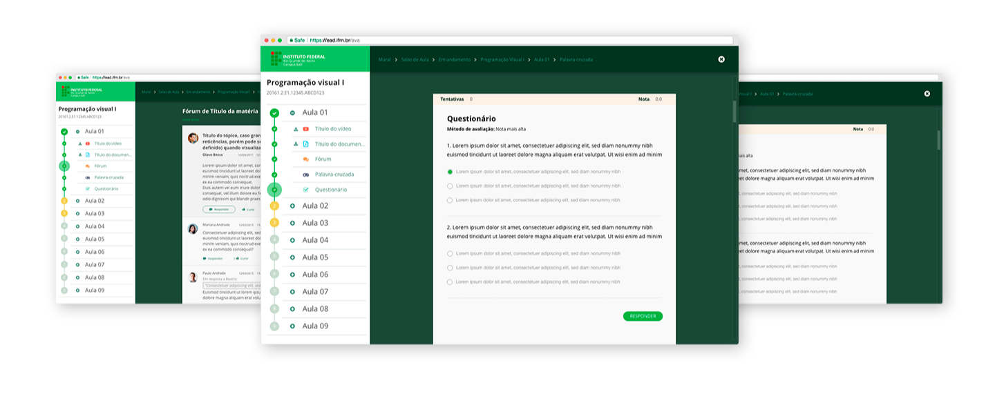
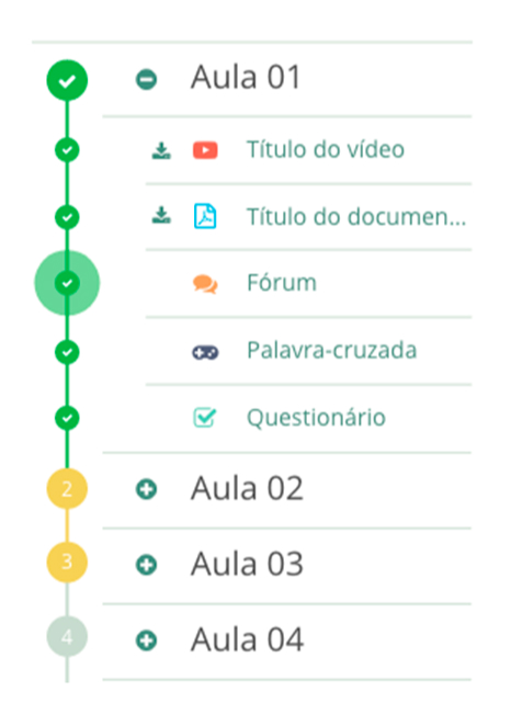
Progress timeline
This feature ensures that students don't waste time searching for where they left off in their studies.
Responsive Interface
Ensuring that students can seamlessly continue their studies from anywhere.
Lessons learned
Lessons learned
Three years later, the update was only partially accomplished. What could have been done differently?
One hypothesis is a gradual implementation, prioritizing better-targeted usability goals.
The development team may have been overwhelmed with the amount of work, and there was no prioritization planning about which features to deploy. These could be done from a series of sprints comprised of research and testing.
That may seem slow and the changes may be far from impressive, but users would be assured that developers cared for their experience, and were constantly working for incremental improvement, not just bug correction.
Three years later, the update was only partially accomplished. What could have been done differently?
One hypothesis is a gradual implementation, prioritizing better-targeted usability goals.
The development team may have been overwhelmed with the amount of work, and there was no prioritization planning about which features to deploy.
These would be done from a series of sprints comprised of research and testing.
That may seem slow and the changes may be far from impressive, but users would be assured that developers cared for their experience, and were constantly working for incremental improvement, not just bug correction.
Thanks for visiting!
© Copyright 2024. Ígor Jales - UI/UX Designer

