Challenge
Challenge
Challenge
Challenge
Designing a web-based system to consolidate the operations of VIVA, a Photo Concierge firm that works within resort hotels.
My role
My role
My role
Product Designer (UI/UX Designer)
Product Designer (UI/UX Designer)
Product Designer (UI/UX Designer)
Platforms
Web on Desktop Computers; Web on Tablets
Web on Desktop Computers; Web on Tablets
Year & duration
Year & duration
Year & duration
2020, 2 months
Our Client
VIVA, a Photo Concierge company present in Brazilian hotels and resorts, at the time of writing, in Natal and Maceió, with units in six resorts.
The company offers to record the moments chosen by the client in an agile, friendly and professional manner and sells souvenirs in the form of photo albums and souvenirs.
VIVA, a Photo Concierge company that is set in Brazilian Hotels and Resorts and, by the time of this job, in the cities of Natal and Maceió, with units in six Resorts.
The company offers photoshoot for moments chosen by the client, in a fast, friendly and professional way. They sell these as mementoes, photo albums, and other pieces of memorabilia.

Viva Brand Identity by Mariz Agency
Discovery phase
Discovery phase
The problem
The problem
VIVA’s workflow is well-structured, but it would benefit from a centralised system for their service and production teams. Their activity records and processing are scattered across different apps and documents, making it difficult for management to track and audit the entire process. This is why they wanted a system from the software house where I was employed, and I was tasked with designing it.
VIVA’s Workflow, as they see it…
VIVA’s Workflow, as they see it
To gain a thorough understanding of VIVA's workflow, the Product Owner and I held discussions with VIVA’s directors and some of their workers. They kindly provided us with their internal training manuals that included helpful flowcharts.
…Now VIVA’s workflow for a Web System
Getting to VIVA Web System’s workflow
Yes, more flowcharts to work with
Before designing screens, we needed more flowcharts!
We had to tailor those numerous flowcharts into a comprehensive service blueprint that could illustrate all of their actors and actions. We also engaged in online conversations with VIVA's team to ensure accuracy.
Taskflow
Taskflow
I mapped a linear task flow based on my understanding of VIVA's production process. At each step, I noted down which VIVA employee performed which task and what information was collected (such as the date, time, and information pieces for the brief).

Viva’s processes Task Flow, Ígor Jales 2020
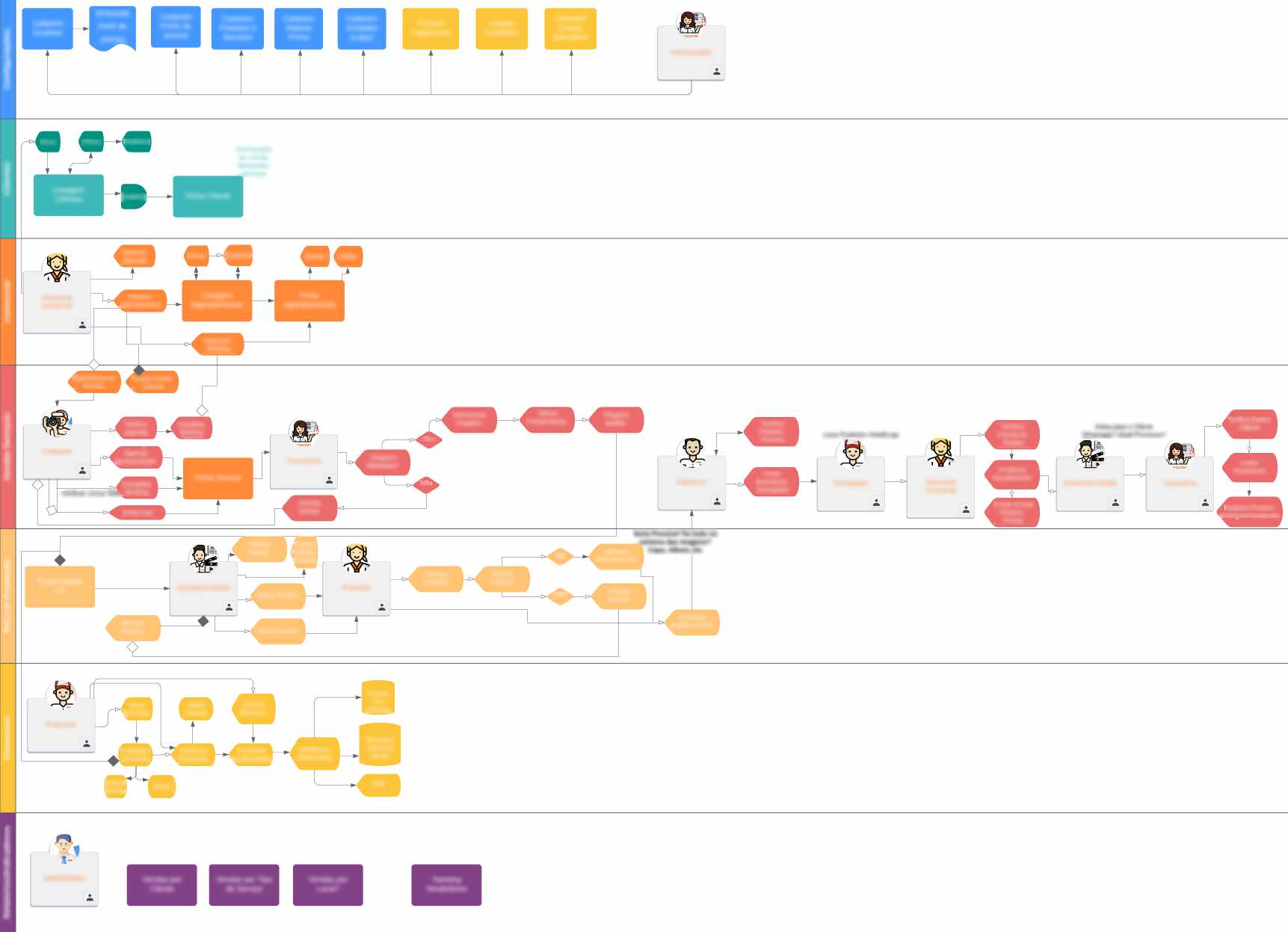
Service Blueprint
To gain a clearer picture of the workflow, I mapped an adapted Service Blueprint, by separating horizontal lanes for each employee.

Viva System User Flow for four different Users, Ígor Jales 2020
Hence how we were identified the user roles that the system would separate. The following symbols mark the users’ roles on the diagrams so we’re not lost:
From left to right: “Any user; Commercial assistant, Photographer, Sales consultant, Editing assistant, printing operator, Financial analyst, Administrator”
Design Phase:
Envisioning the System
Design phase
Ideating and sketching
Control Forms
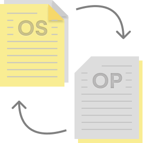
By notating these input at every step of the tasks, I was able to determine the best ways to separate that data and design two linked control forms, that would be treated by the system as different objects, which we named Service Order (OS) and Production Order (OP).
Although they were part of the same product order, the purpose of separating those forms was to show different data, serving different purposes for different users/agents in the process.
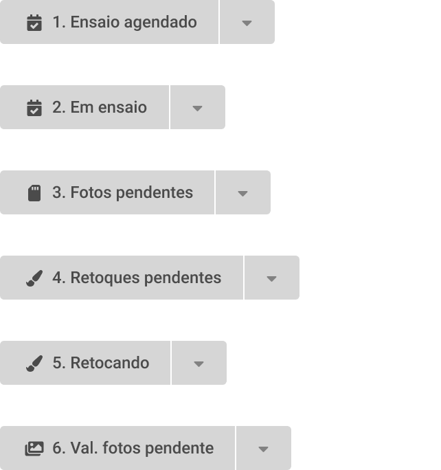
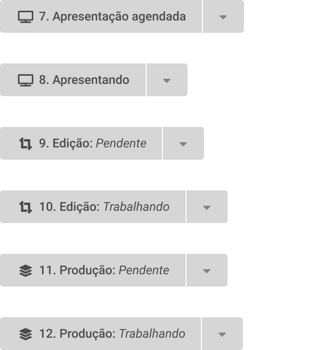
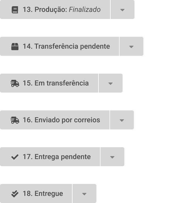
I listed 18 different status for the form on the production line. After discussing with the Product Owner, we narrowed down to 12 status, from which 5 were on the Service Order and 7 on Production Order.

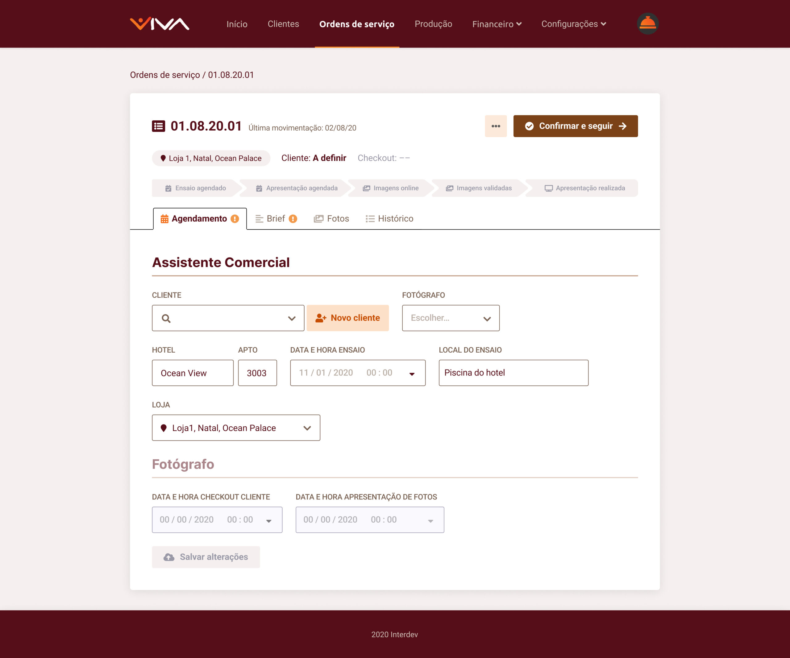
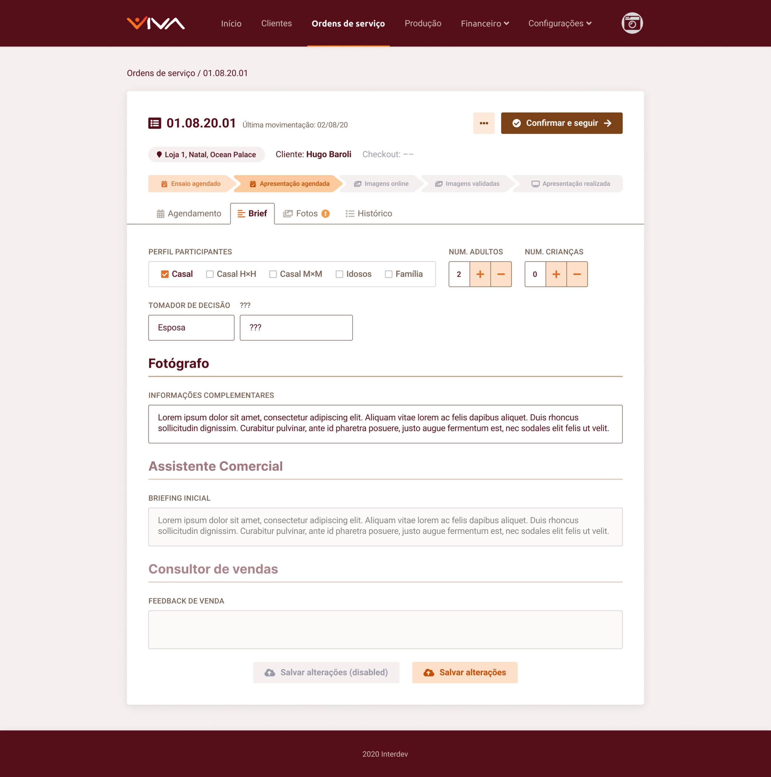
The five Service Order Status.

The seven Production Order Status.
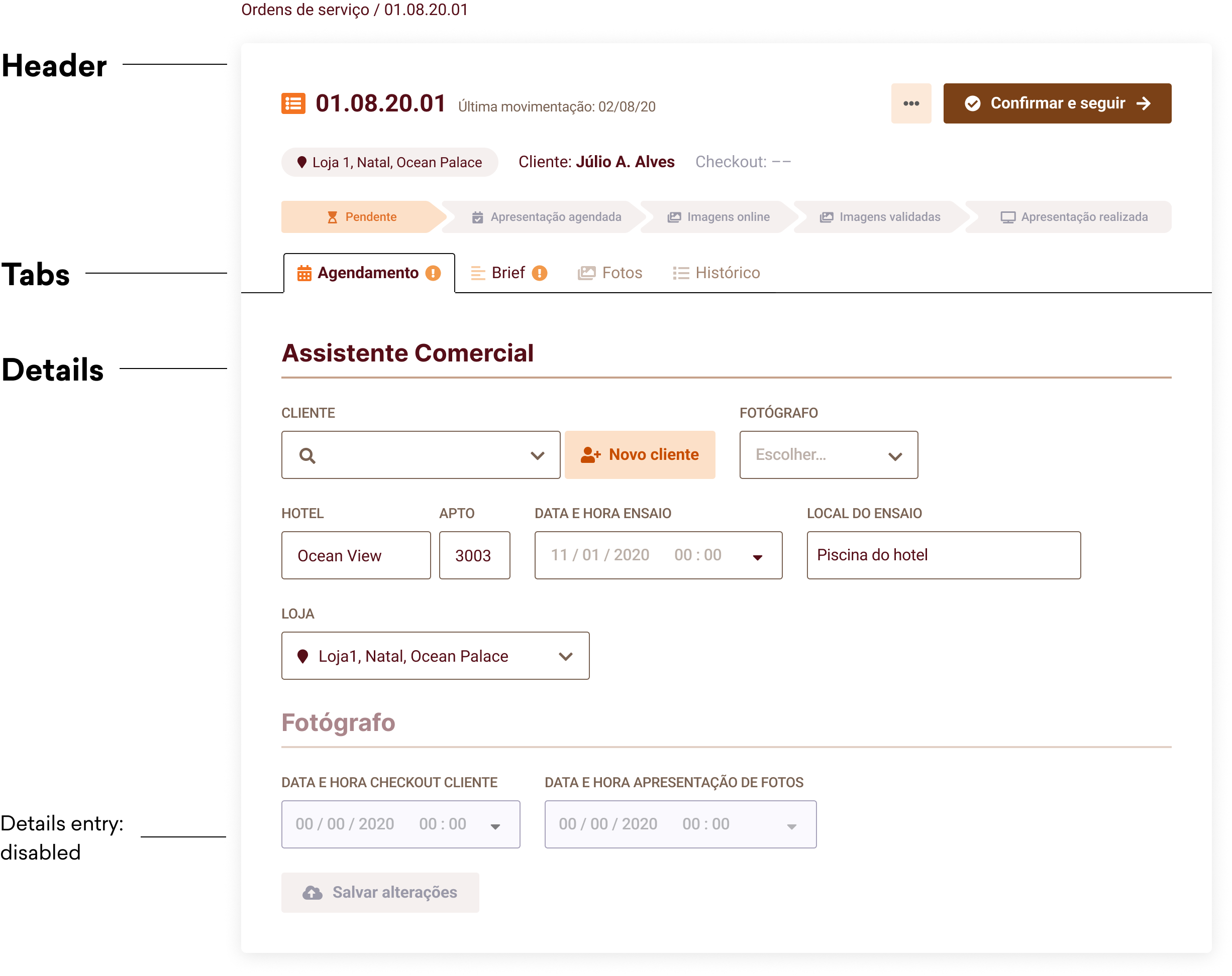
Service Order Status
On the form header, there’s the protocol number, the actionable button for confirming and sending the form down the production line into the next status, and some other relevant info for the users.
Below, there are tabs for Booking, the Brief and Photos, all work for all the users involved in the shop process stage.
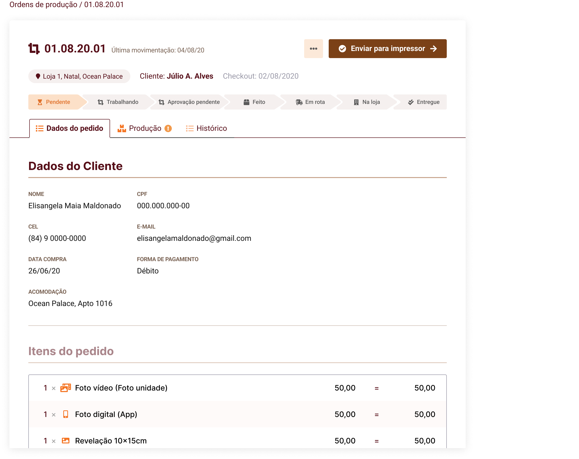
Production Order Status
The header is here again, and so is the protocol number, biding an OS and OP as twin parts of the same object.
Below, the Order Info tab shows relevant information for guiding the product assemblage. On the Pre Production tab, the editor can check the files to be printed.
Prototype testing & Stakeholder Presentation
Ideally, the system should have been tested with a handful of simulated use case scenarios. We showed the prototype to users before its visual design was complete, since they were the only and actual users and we had a tight deadline.
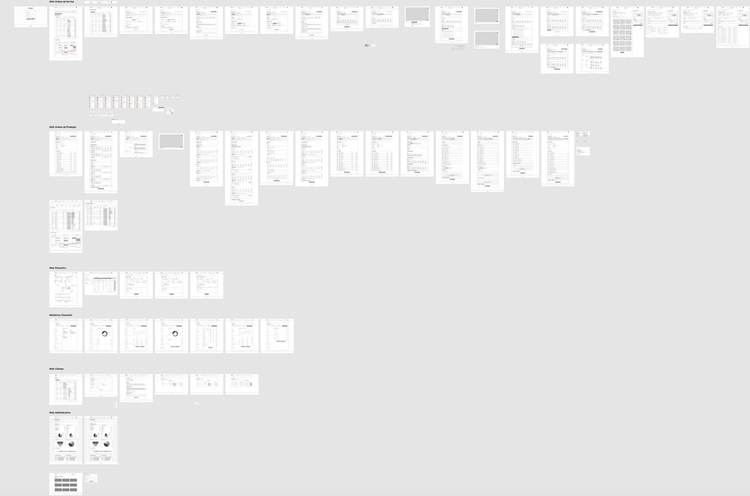
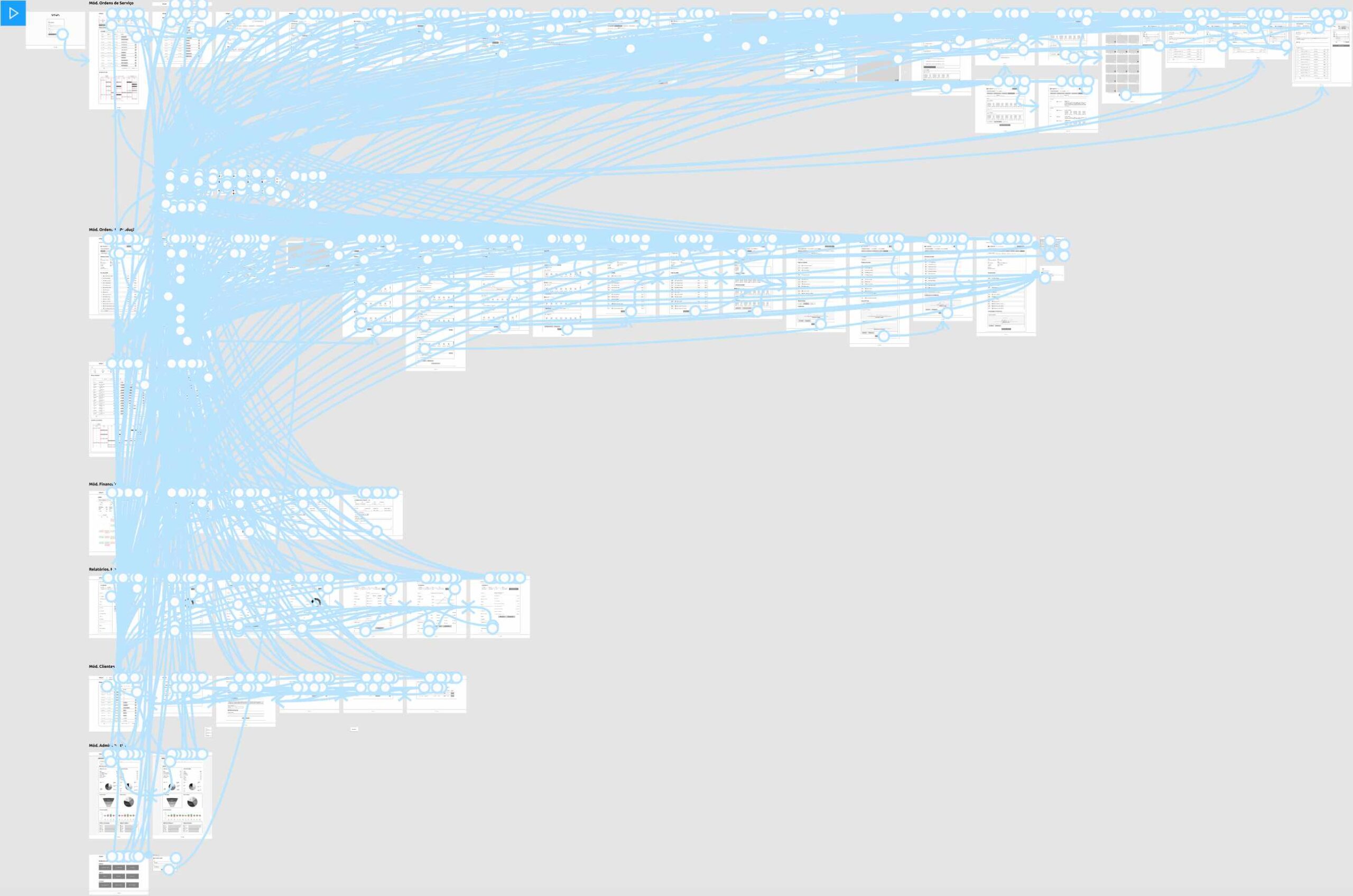
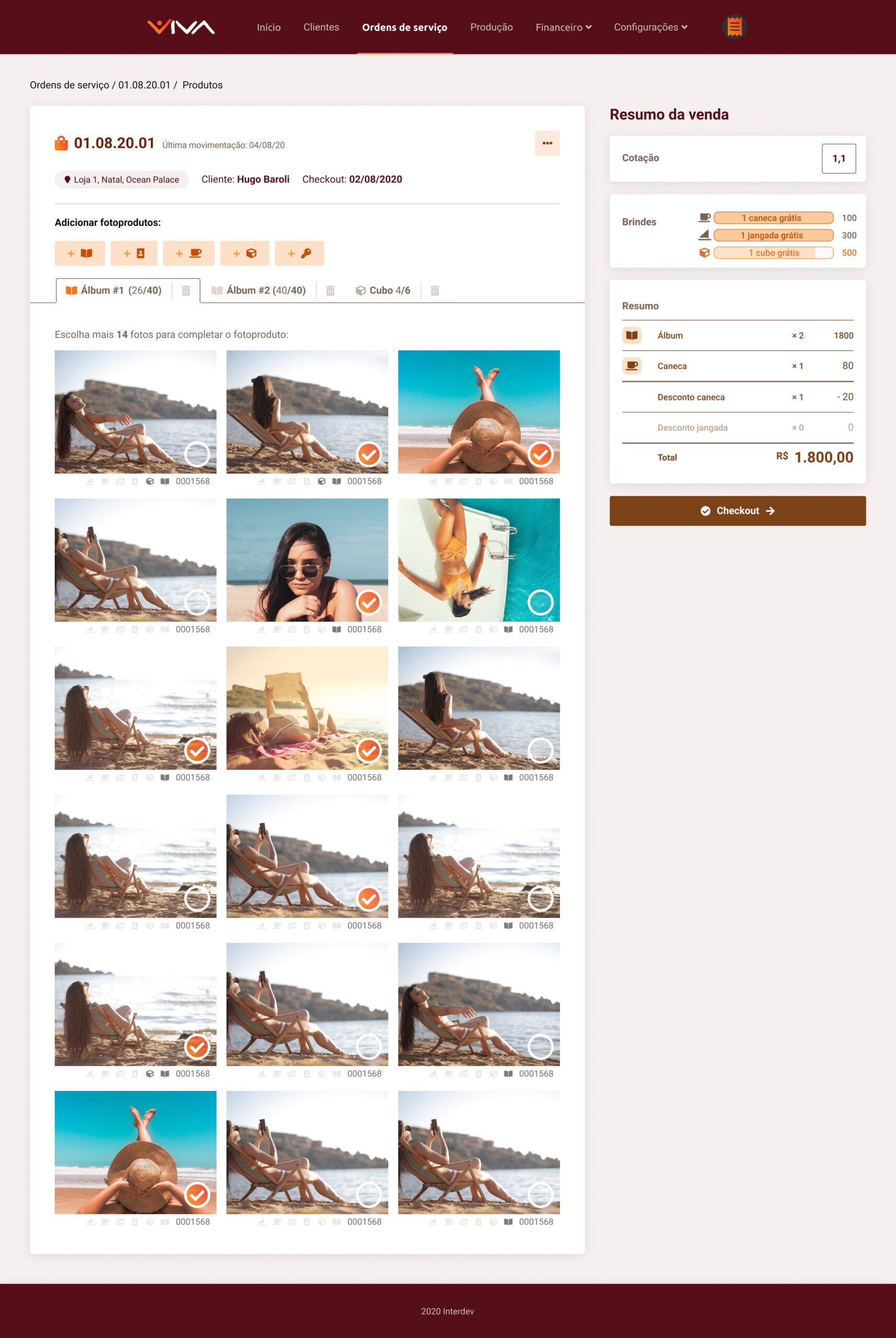
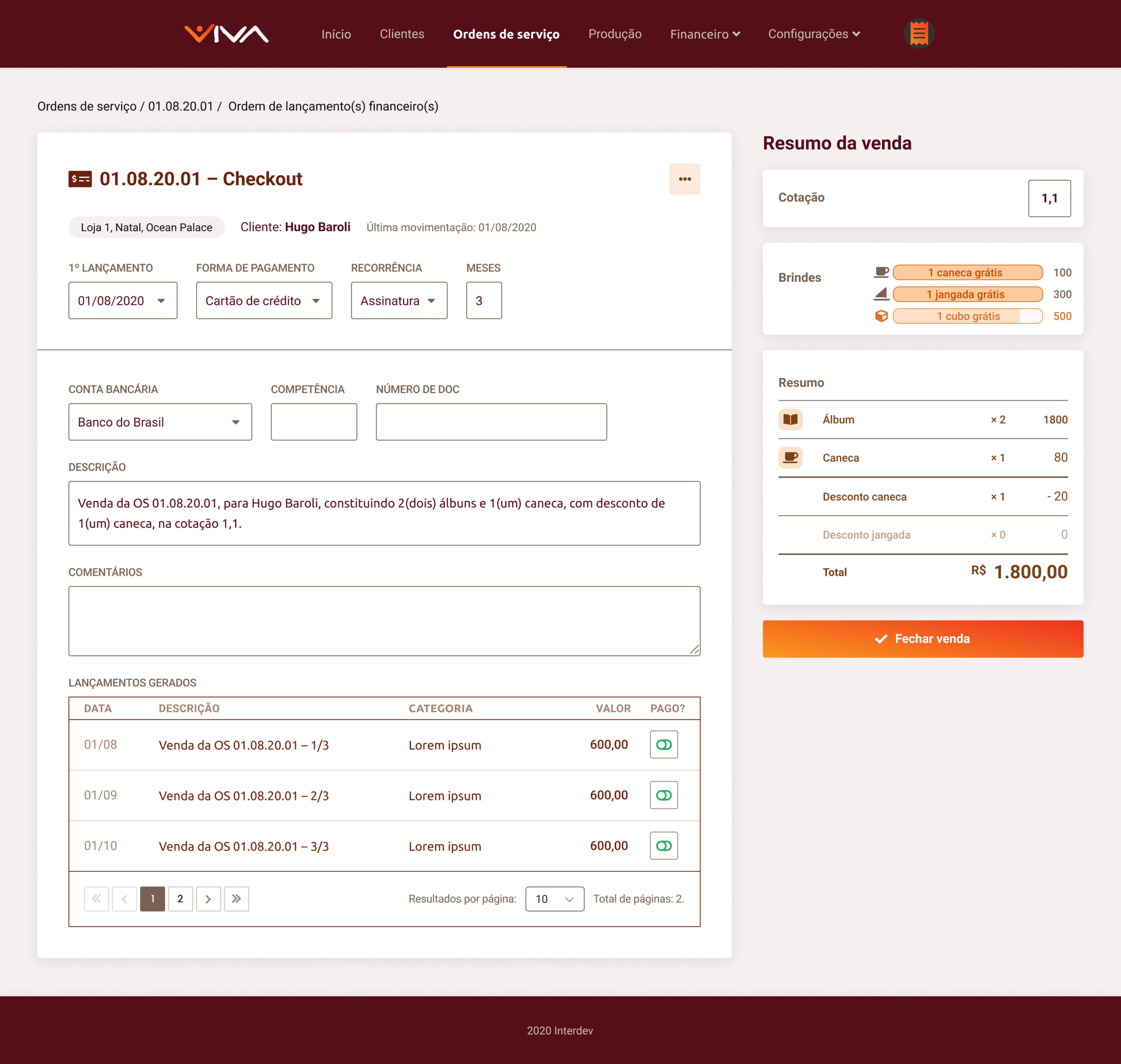
The complete system as shown in the Figma File. Blue arrows mean working links when we switch to the navigation prototype.
Standard System sections
Standard System sections
Login
With validation states and password recovery screens.
Clients
A contact list of clients and all their meaningful information. They are also linked to their Orders.
Settings
Settings
Adjustments for access levels for users, among other options to be defined. Available for admins only.
Dashboard
Dashboard
Home screen for admins, but it was the last to be designed. Features “Big numbers”, Statistics, some indicators and quick views.
Aditional sections
Finances
A module that was also within the project scope, and one that didn't require my input and research. Includes cash flow registries and account grouping, among some other options.
Financial reports
Financial reports
A feature inside the Financial module that was also in the scope. It can generate charts in different shapes as performance indicators.
Establishing the Visuals
Visual Design
Typography
Ubuntu is a close match for Uni Sans typeface from VIVA’s logo. In some spots that required improved readability or visual nuances, I paired it with Roboto.
A Brief Color Scheme Study
Color scheme study
Due to a tight deadline, this wasn't a priority, so I took VIVA’s colour scheme, played with luminance, text styles, narrowed it down to the necessary: a few usable, distinctive colours.
VIVA System’s colour shades

This would ensure neither developers nor any designers in the future would be dealing with redundant colours and confusing decisions.
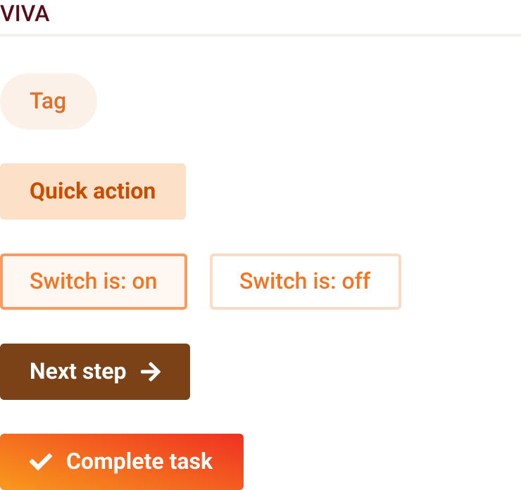
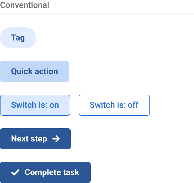
For buttons leading a step further into completing a task, I opted for dark brown. Those would nudge the user about the importance of clicking them, but would be assigned for actions that are not definitive, where users can go back and change their decisions.
Whereas for definitive actions, like completing or sending a request, there would be a orange gradient button, just like VIVA’s main colour.

Main concerns
Orange can be easily mistaken for red, traditionally associated with errors and destructive actions. That raised concerns about potential confusion for users.
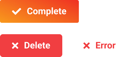
Given the tight deadline, I went back on my decision and recommended abandoning orange buttons, in favour of brown ones instead. The auxiliary icons, such as forward arrows (→) would hint at the existence of further steps, and check marks would hint at conclusive, definitive actions.


Later note (2021):
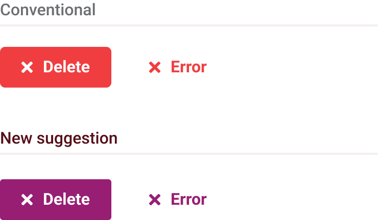
I found a solution two years later, that would have freed up the use of orange for positive actions without ambiguity: by adopting purple instead of red, as the system’s ‘negative’ colour.
Purple, like red, is often perceived as a warning sign in the human body, allowing users to quickly associate it with a negative context through minimal exposure in the system.
The outcome
Both the VIVA team and Interdev, for whom I worked, were satisfied and optimistic with the system design. I also met the future users, who were pleased with the functionalities but very anxious for the full implementation of the system.
I believe the design would have benefited from having more time, and I would have loved to make continuous improvements to the system’s experience, but unfortunately, that was beyond my control.
Lessons learned
- In a small-scale project, it may be possible for the process to become more artisanal, with dynamic contact with the users and constant feedback.
- Designing for a good user experience requires adequate time for testing and iteration. However, in some situations, we may need to work with the resources and timeline available to us.
- It may be challenging to introduce new design methods to experienced developers who already have their own workflows. I decided that my next step would be to work at a company that had the space and resources to work in this way — and it worked out. In this case, I was hired at NTT DATA!
- When the primary colour is too close to red, try using purple for negative alerts.
Thanks for visiting!
© Copyright 2024. Ígor Jales - UI/UX Designer

